
Food Photography Backgrounds
As a food photographer, I’m always on the lookout for good backgrounds to use in my photography. In some shots, the background is very important, on other occasions, it’s not that important at all… Here’s what needs to be considered when selecting a background for food photography.
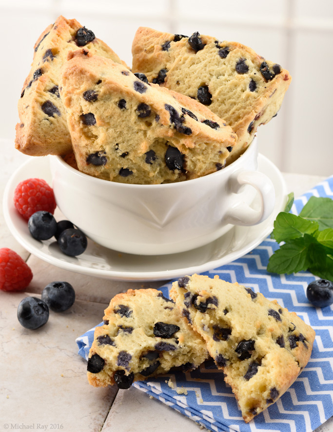
1. Color – The mood of the photo is often set by the color of the background. A “light and airy” background conveys one feeling whereas a dark and moody background conveys another. To me, breakfast is best illustrated by light colors and dinner is depicted best with darker colors. Do you agree?
2. Texture – To me, a lot of texture in the background can actually distract attention away from the food. If your goal is to make a “pretty picture”, then lots of texture is fine. If, on the other hand, your goal is to show the food as the hero of the shot, then too much texture is a bad thing. That’s the difference between editorial and advertising photography.
3. Appropriateness – Like it or not, objects are symbols. The color of a wall or counter top might be appealing, but if the pattern of that counter top reminds people of something, then it has an effect on the photo. If the surface reminds people of the 1970s, then the food photographer needs to take that into account. If the surface looks “dirty”, and the food is sitting right on it, then some people might be influenced by that situation.
As a food photographer, backgrounds are something I think a lot about. I love looking at other photographer’s photos to see what backgrounds are popular and how they are being used.