Editorial Portrait – AmeriServ Financial Annual Report
I love being a commercial photographer here in Pittsburgh, and one of my favorite things to shoot is an Editorial Portrait. It’s more play than actual work. You go into a location and try to find an interesting and applicable environment that you think will make a compelling portrait. Then you work on the composition, the lighting, and all the other aspects of creating great editorial portraits.
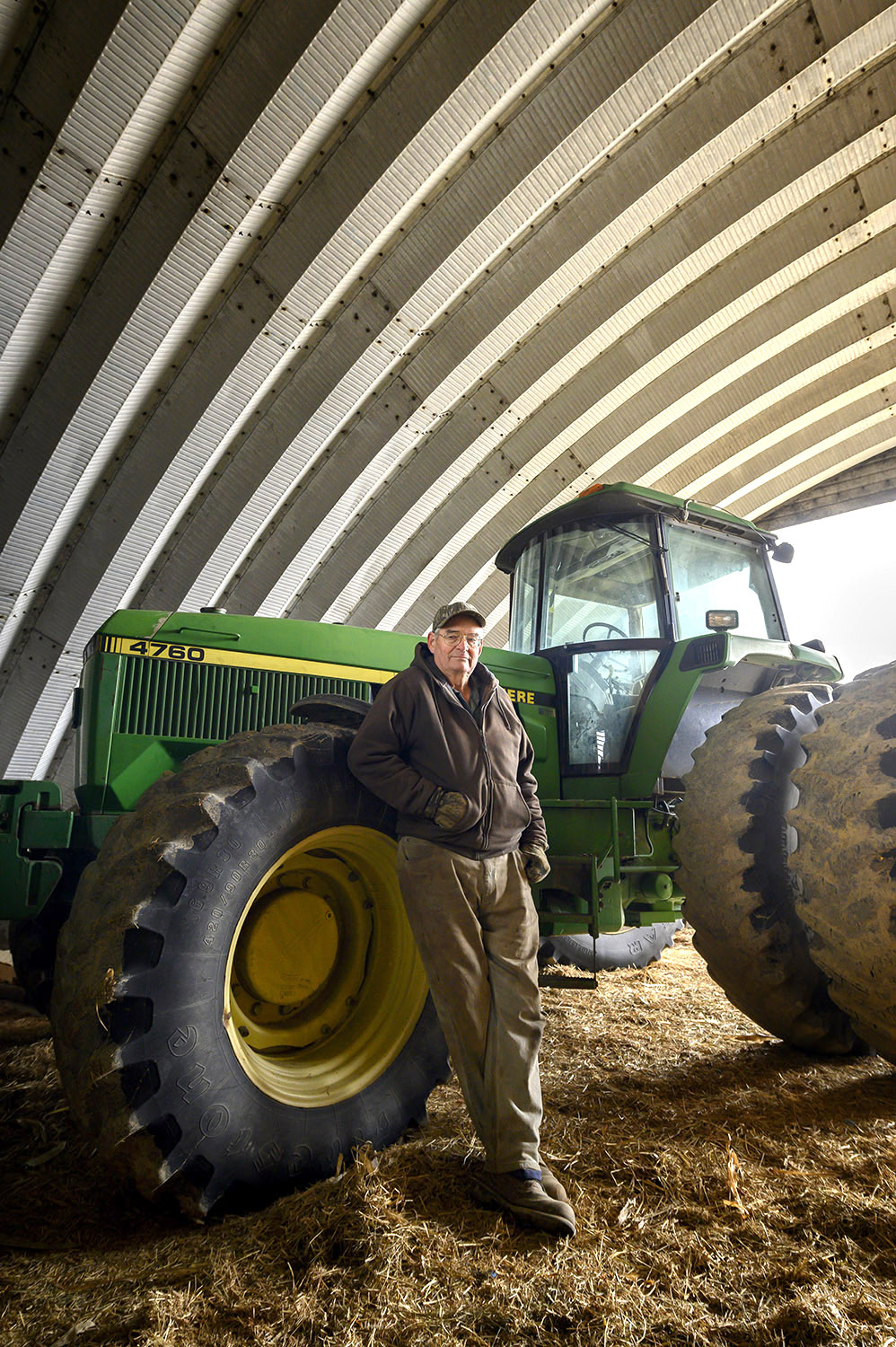
This project was for the AmeriServ Financial annual report, whose headquarters are located in Johnstown PA. I was approached to do the shoot by Monica Watt, of Monica Watt Design Group, one of my very favorite clients…. The assignment was simple, make some compelling portraits of various people that were helped by dealing with AmeriServ Financial. We were to shoot editorial portraits of several of their customers, in various locations. This is one of my favorite editorial portraits from the annual report, but there were a few others that were in close competition. Maybe I’ll show you some of the other shots in another post.
I’ve included some of the photos leading up to the final shot to show you how the sausage is made, so to speak. The truth is, I don’t get to choose the final shot that is used for the annual report, so I’ve included one or two shots that may have been in the running for the one they went with.
Editorial Portrait Elements
In my opinion, there are many elements that go into a good editorial portrait. Here is a list of a few of them…
The appropriateness of the background
This composition
The pose of the subject
The expression of the subject
The lighting
The Post-production
The appropriateness of the background – The whole idea of an editorial portrait is to tell a story about something or someone. In most cases, you’re trying to illustrate the idea being written about in the accompanying copy of an article or marketing piece.
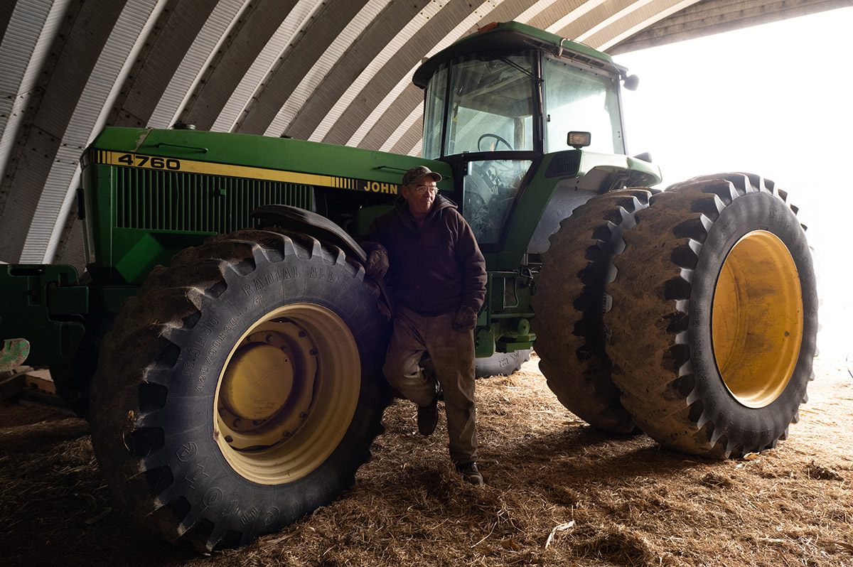
The background or environment of the subject needs to relate to the story being told. In this photo, the guy is a former. We began by taking a little tour of his farm to find an appropriate location, and his barn and tractor seemed to fit the bill nicely. What better icon is there to communicate “farmer”, than a barn and tractor, right? And tractors aren’t exactly cheap either, which ties into the need for a financial institution.
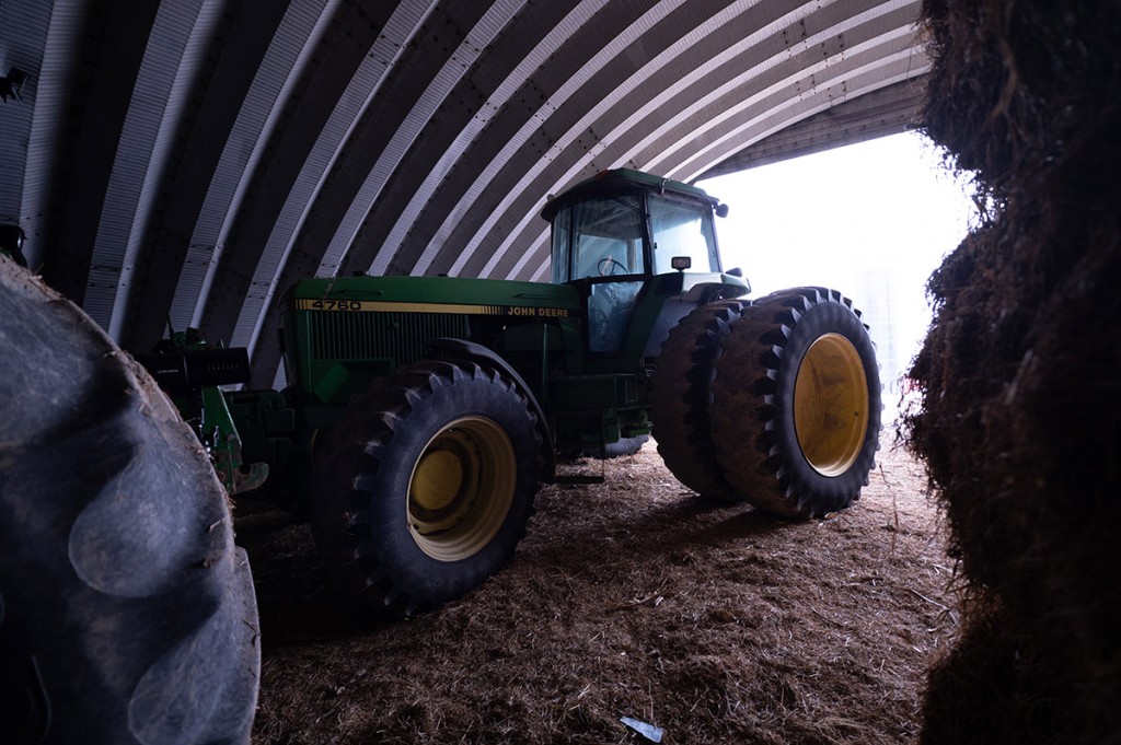
Here’s what it looked like when I walked in the door, with no subject and no lighting.
The composition
I really love the composition of this photo. Finding and using the leading lines of the ceiling is what really makes this photo, in my opinion.
One thing I’ve been playing with when composing my photos lately, is I’m trying to get away from being too close the subject. On the one hand, the closer you are to the subject, the better you see the subject. On the other hand, the smaller the subject is in the frame, the more you can use the background to tell the story and come up with more compositionally interesting photos. I guess it all breaks down to style and personal preferences. It’s a compromise that I find interesting.
On a totally tangent subject… I’ve been giving a lot of thought to the subject of “What makes a photographer’s work look dated?” There’s that thin line every artist walks between having a style and being in a rut. I’m trying hard to keep my work looking fresh. I’m not sure I’m being totally successful, but at least I’m trying.
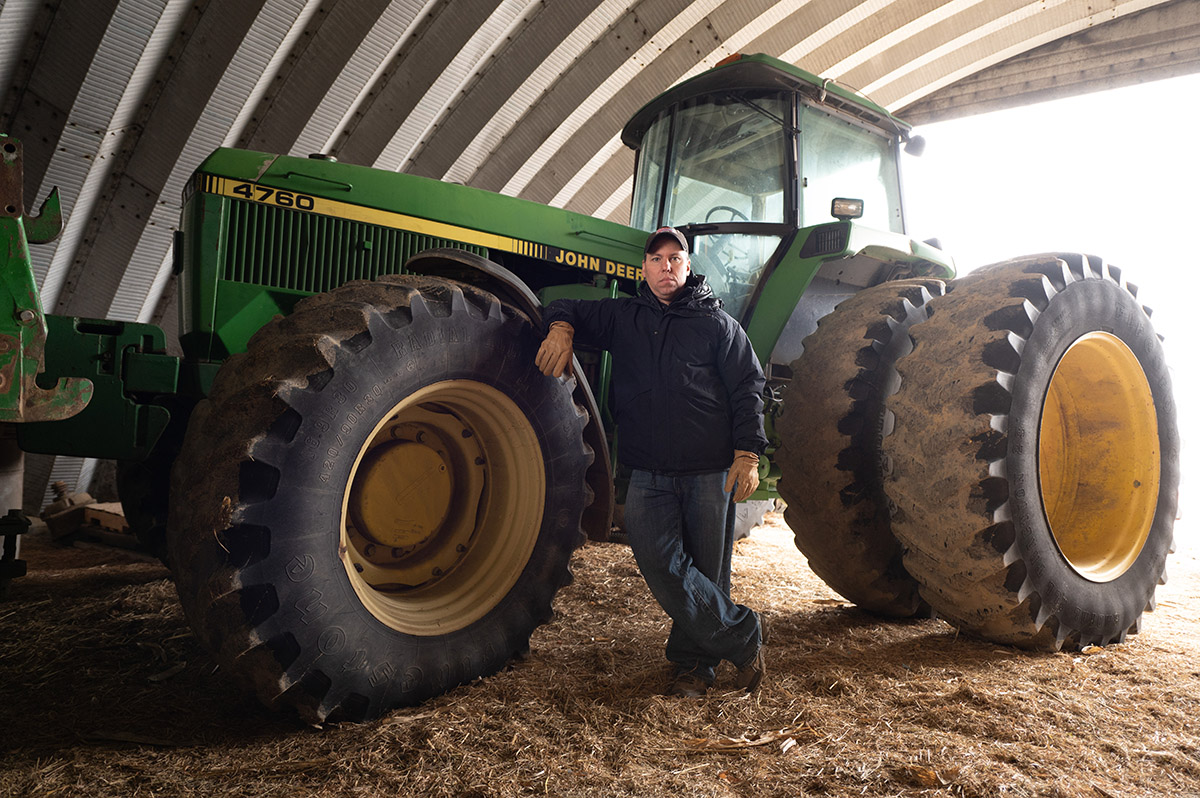
Here’s a photo, from early in the shoot, while I was working out the composition and lighting. This is Michael Reed, my photo assistant, and a really great guy.
In the past, I’ve always been in the camp of “the subject is most important”, so the closer the better, but lately, my preferences seem to be changing and that’s probably a good thing. I guess it’s called “evolving”, or maybe I’m just trying to keep up with the times. Or maybe I’m just getting bored with the old and find myself attracted to something new. Either way, I kinda like shooting looser and finding what’s interesting about the environments of my editorial portraits.
The pose
The subjects of editorial portraits are usually assigned and not chosen by the photographer. Some subjects are totally at ease in front of the camera and some are stiff as boards. This gentleman was somewhere in between. The pose in this portrait isn’t the best, and that’s probably my fault. The pose isn’t all that bad, but I’m not entirely happy with what he’s doing with his hands. I guess having the subject smaller in the photo helps with little things like that, but it also makes it tougher to notice when you’re shooting too. I don’t think the hand is a deal breaker, but it could be a bit better.
The expression
I’ve always been a fan of the “serious” look on a person. I feel it gives you a better look into the soul of the person. Sure, there are portraits where it makes sense to have smiling subjects, but in general, I’m attracted to the ones where the subject has blank expressions.
This is how I rationalized his portrait. He’s a farmer and farming is hard work.
The lighting
I’ve always prided myself in my ability to light, and I think I did a pretty good job here. It looks natural. All I did was add a bit to the front, without flattening the subject too much and without overnighting everything else. The outside of the barn is blowing out to a bright white, but I’m perfectly fine with that.
Here’s what it looked like when one of my flashes didn’t flash. You can see what a difference lighting makes in an editorial portrait.
Another unrelated tangent idea. A couple of years ago, I started doing sound and lighting for a few independent films, here in Pittsburgh. Nothing big, just some small independent productions. It’s been a lot of fun and I’ll write a post or two about that later. The thing is, ever since I started studying lighting for film and video, I’ve come to realize that there is sometimes a huge difference between what I considered to be “good lighting”, and what is “effective” lighting. In other words, for movies, badly lighted scenes are sometimes the most realistic looking. That’s not the case here. I think this is naturally lit without looking “bad”. I’m not sure why I brought that up, but I do find it interesting…
The Post-production
I’m not really known for going crazy with my retouching, and thaonclusiont’s the case here too. I did a little edge burning and maybe hyped up the ‘sharpness” a bit. You almost never want to increase the texture with a female subject, but I often add a bit to men and especially older men. I think it adds a little punch to the photo. Women usually don’t appreciate the extra texture to their faces, but old men don’t seem to care, and, it makes them a little more interesting to look at.
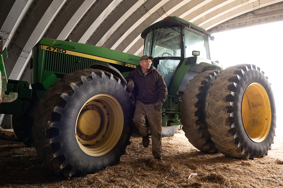
Here’s an alternative portrait I would have been happy with them using. It’s a slightly more “wide angle”, and the pose is a little more natural.
Conclusion
Well, that’s my story of a recent environmental, editorial portrait, shoot. This has become one of my favorite types of shoot. If you’d like to see more of these kinds of photos, take a look at my people gallery. If you’d like to have me do some of this kind of photography for you, I can be reached by email at mray@michaelray.com or by cell phone at 412-418-2838. Feel free to text me if you prefer. Thanks for reading my post and if you’d like to make any comments, I’d appreciate the feedback.