
Color in Food Photography
I often ask myself why I like a particular food photo and almost always, the color palette has a lot to do with it. Everyone has their favorite color, but I’m guessing the subconscious is normally attracted to particular colors and is revolted by others. With food photography, I find myself attracted to earth tones and blues too. Maybe it’s different with you. I’d be curious to know…
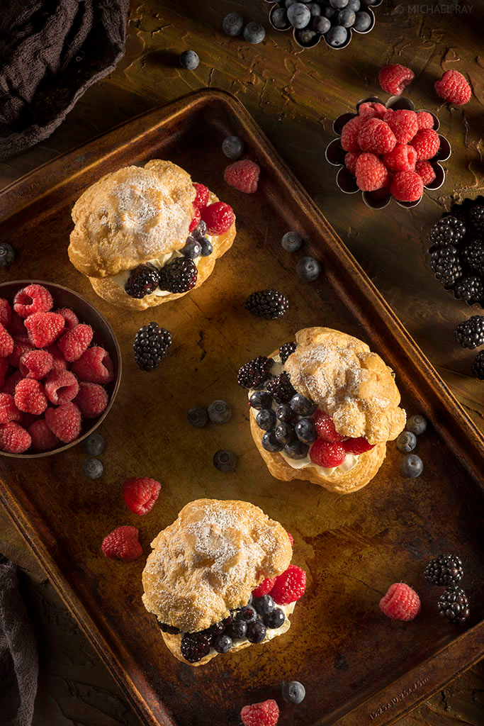
In this photo, I really like the warm brown tones and the texture in the background. The greenish tones of the background sort of remind me of something a little rotten, but for some reason, it doesn’t ruin the photo for me.
The color palette of a food photo
Food photographers can’t always choose the colors of the food they’re hired to photograph, but they can usually at least influence the colors selected for the props and backgrounds. The color palette of the overall food photo has a large impression on the viewer. The viewer will react to the overall “look” of the photo, even without examining the individual aspects such as composition, focus, lighting, and such… Color is probably the thing that makes the very first impression.
Food Photography prop and background colors
In food photography, there are basically two functions of the color of the props and background.
Contrast with the food
If you’re trying to show the viewer the food in your photo, it’s important to select a plate or a prop that visually contrasts with the food. If the food blends with the plate or cutting board and doesn’t “jump out” at the viewer, then the photo really doesn’t work.
Set the mood
Like I mentioned above, colors seem to bring with them a subconscious effect of the viewer. My favorite color is red, but for food photography, I almost never select red props. I’m not sure why, but maybe it’s that red is a color of action and doesn’t work well with most food photos. On the other hand, I seem to be attracted to browns and blues.
Conclusion
Sure, there are other things that influence food photography, like lighting, composition, prop texture, and a million other things, but I think you’ll agree with me that the color palette of a food photo GREATLY affects how well people like or dislike it.
What colors do you find yourself attracted to in food photography?
BTW – I’ve been really active on Instagram lately. If you’d like to keep up with my food photography, feel free to follow me on Instagram .